Dashboards: 5 key elements to success
Updated: 03 Mar 2023
I've been meaning to post about building dashboards for a while now as a follow on from the Beautiful Data post. Data are increasing becoming a part of our everyday working life and far too often they are presented as a basic table - often hard to see and difficult to interpret. In this post, I thought I'd get the ball rolling again on how to make data presentation more insightful.
1. Relevance
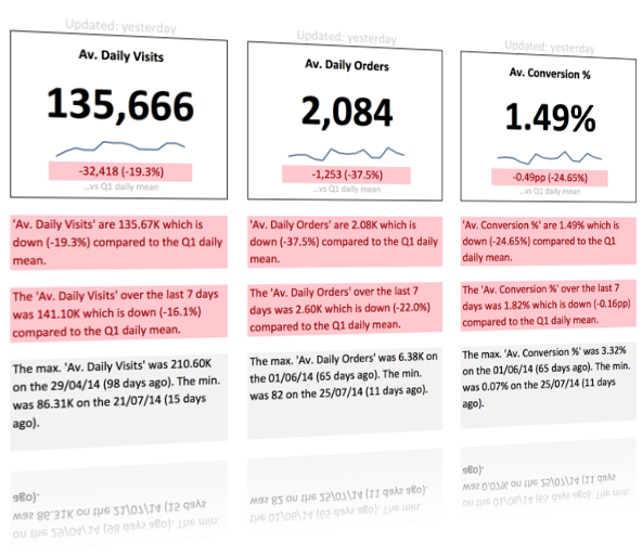
The above image shows three Key Perfomance Indicators (KPIs): Visits, Orders, and Conversion Rate. These are very typical metrics, used by many sites as they detail traffic volume (foot fall), sales figures (throughput), and effectiveness (efficiency). People can easily get lost or simply loss focus when looking at data and so ensure that you present the right data to the right person at the right time.
2. Context
A critical element of data presentation is context. Without it, you are simply stating numbers which will be meaningless. As such, its vital to always present a trend for a given metric, as this instantly gives temporal context, i.e. how the metric has varied over time.
In my dashboard designs, I therefore present a trend line - either as a dedicated chart or as a sparkline as shown in the image above. Additionally, I compare the metric against comparable time periods: Last week (WoW: Week-on-Week), Last year (YoY: Year-on-Year), 3-month running average, Targets, or a predicted/forecast value. For the comparators, I find it best to present both the liternal numerical (delta) and the percentage (or percentage point) change.
3. Colour
In the example above, I've also used colour to alert the user to a negative change. Colour can play a great part in communicating the story behind the data, but you need to use it sparingly. You want the user to focus on impactful change and not to be distracted by other elements - think of a flashing red light in the cockpit in a plane. However, you need to also take into consideration that around 5% of the male population have a red/green colour-defect (See: Deuteranomaly) and so don't rely on colour alone.
A good test for a dashboard is to stand far enough away from it that you cannot see the actual numbers and try to determine the overal gist, i.e. is it good or bad? You can also try 'The Drunk User' - Save this link to bookmarks, visit any webpage & then activate it and press escape to exit (Credit to 'drunkusertesting.com') - test to see if you dashboard can stand on it's own feet. See it in action here:
4. Story
I've started to introduce into my dashboard designs is the concept of a plain english description of the data. I've found that people often add a 'commentary' to their dashboards when circulating with other stakeholders, but this is typically just a description of the data and not insight. As such, I've tried to take away the need for this basic commentary, by adding an automatically generated description of the data, e.g. how it compares to the last 7 days or to the highest and lowest points in the trend. The intention is that this should free up a bit of time to focus on the business impact rather than the basic logistics.
5. Aesthetic
Once you have all the core elements of the dashboard in place, you then need to spend time on the look and feel, i.e. the aesthetic. You want to make the dashboard engaging for your target audience - don't put them off with pointless or confusing design!
If you apply all of the above, then your dashboard should sing!
Lastly, think about making the dashboard interactive. Ideally, you want to allow the user to investigate the data a bit more to help them answer questions they might have. In my experience, this is something that needs to be carefully designed and evolved based end user feedback - start with a simple flat structure and then iterate based on requirement. I'd recommend a data driven approach, whereby you allow the user to drill-down into the data itself. For example, you may allow the user to click on the 'Visits' chart to see a more detailed breakdown of the traffic volumes. You may also want to consider giving the user the ability to filter or segment the data to make it more relevant to their needs - again you'll need to think carefully about this to make sure that you have your source data structured in a way that allows segmentation.
This example Excel 2010 dashboard schematic, which demonstrates the various best practices that I try to build into all the dashboards I build for my clients, can be downloaded below:

So, what do you think? Got any good examples to share? Let me know in the comments section below.
Be the first to comment! Add a new comment below...

Add new comment (subject to moderation):
| Full name: |  |
| Email: |  |
| Website: optional |
|
| Article Rating: optional |
|
| Comment: optional |
|
 |
|
| Type the text shown in the image above: | |
|
|

 @analytdata
 facebook
 LinkedIn